
This week Benjamin Moore officially announced their 2016 Color of the Year. While their color choice may seem less than colorful, their choice is actually one of our favorite, versatile palettes.
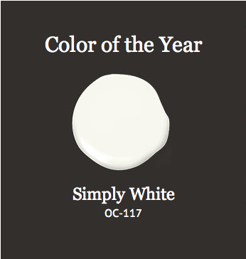
Simply White exhibits a clean, fresh snow just as it’s fallen. It’s a crisp, multi-purpose white that’s always been a favorite for trim and walls. We are now reminded that white is also the perfect neutral for our walls.
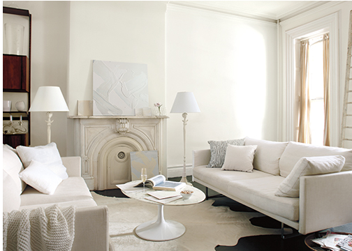
Living with white is refreshing. It reminds us of being brought back to simplicity. Pair fresh greenery for a natural atmosphere.
BenjaminMoore.com
Living with white on the walls doesn’t mean the entire home has to feel sterile. In fact, white provides us with the perfect blank canvas to which we can add seasonal color. If you’re the type of person that enjoys the crisp coolness of the winter, adding blue or light gray to a white room will evoke that feeling all year long.
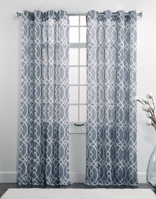
Dorian Indigo by Twill & Birch
Do you prefer the sunburst colors of summer, try adding sunny yellow or turquoise blue fabrics.

Solana by Softline
How about the natural blooms that Spring brings? Scatter grassy greens, soft pinks, and lilacs thoughout the room.
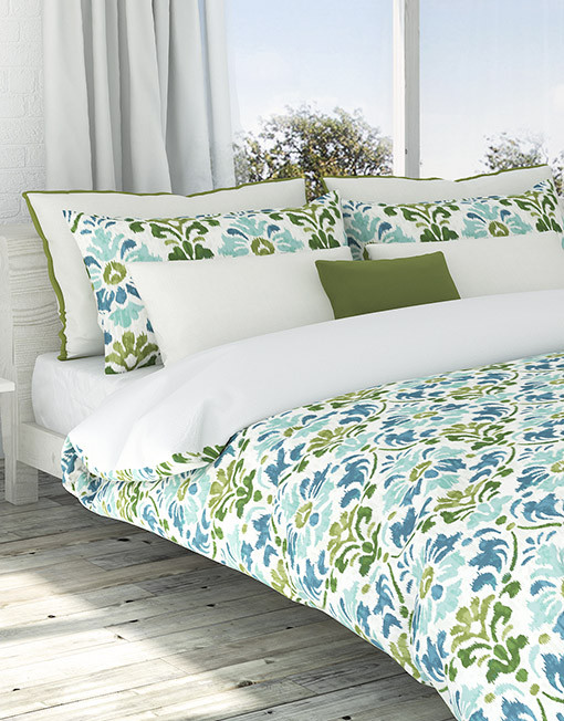
Sasha Seamoss by Colorfly
Or, perhaps the warm colors of Fall inspire you. In that case, a touch of brown, burnt orange, or deep red can be paired with the white canvas.

A Simply White neutral base allows you to live with the season you love or instantly change right along with them.
In contrast, Pantone also announced their 2015 Fall Color Palette which is full of naturally-inspired colors that remind of things that are real and protected. Pantone describes this palette as an evolving color landscape made up of earthy neutrals with fun, bold color. The choice of colors evokes fun, hope, fantasy, a love for nature, and an appreciation for warmth and security.

Pantone’s 2015 Fall Color Picks
Pantone describes their 2015 color choices:
Desert Sage: A cool & soothing greenish gray. Timeless, unobtrusive, naturally-inspired, real.
Stormy Weather: A cool blue-gray, reminiscent of the sky on a gray, overcast day. Dependable, cool, strong, protective, endearing.
Oak Buff: A warm, burnt yellow. Mellow, comforting, warming, nurturing.
Dried Herb: An olive green that’s no longer just military. Organic, sophisticated.
Marsala: Pantone’s color the year. A winey red-brown. Rich, robust, earthy, warm.
Bisque Bay: A lush, elegant teal. Cool, soothing, sophisticated.
Cadmium Orange: An orange that’s reminiscent of the 60’s and 70’s. Playful, warm, welcoming, subtly dramatic with a bold contrast.
Cashmere Lotus: A soft pink hue cultivated in richness. Gentle, upscale.
Reflecting Pond: A deep cooling blue. Thoughtful, stable, composed, secure.
Amethyst Orchid: A vibrant purple. Sensual, bold, creative.
